Thursday 20 August 2009

No success yet, then more animations...


So I've been here dealing with the installation of a software that Yihui Xie suggested me to change the format of the animations displayed in R, she told me that all I needed to do was to go to http://imagemagick.org to download ImageMagick for my operating system and install it, but all I got was lots and lots of files and I haven't found the one to start the installation, so I decided to post the last 4 animations I was thinking to post in here with the code to create them in case you want to try them by yourselves.

The first animation I'm going to start with is called "Bootstrapping the i.i.d data", This is a naive version of bootstrapping but may be useful for novices. As you can see in the first image, in the top plot, the circles denote the original dataset, while the red sunflowers (probably) with leaves denote the points being resampled; the number of leaves just means how many times these points are resampled, as bootstrap samples with replacement. The bottom plot shows the distribution of x bar star. The whole process has illustrated the steps of resampling, computing the statistic and plotting its distribution based on bootstrapping.

The code to generate such animation is:

ani.options(ani.height = 500, ani.width = 600, outdir = getwd(),
title = "Bootstrapping the i.i.d data",
description = "This is a naive version of bootstrapping but
may be useful for novices.")
ani.start()
par(mar = c(2.5, 4, 0.5, 0.5))
boot.iid(main = c("", ""), heights = c(1, 2))
ani.stop()


For the second example I chose an animation called "The concept of confidence intervals". This animation shows the concept of the confidence interval which depends on the observations: if the samples change, the interval changes too. At last we can see that thecoverage rate will be approximate to the confidence level.
If you want to generate this animation, the code is the next:

ani.options(ani.height = 400, ani.width = 600, outdir = getwd(), nmax = 100,
interval = 0.15, title = "Demonstration of Confidence Intervals",
description = "This animation shows the concept of the confidence
interval which depends on the observations: if the samples change,
the interval changes too. At last we can see that the coverage rate
will be approximate to the confidence level.")
ani.start()
par(mar = c(3, 3, 1, 0.5), mgp = c(1.5, 0.5, 0), tcl = -0.3)
conf.int()
ani.stop()


The third animation I chose was one I thought would be pretty useful, it's called "The Newton-Raphson Method for Root-finding". I think this animation doesn't need further explanation, it goes along with the tangent lines and iterates, and you can also change the function that the example gives you to try as default, pretty interesting one.
So the code is:

oopt = ani.options(ani.height = 500, ani.width = 600, outdir = getwd(), nmax = 100,
interval = 1, title = "Demonstration of the Newton-Raphson Method",
description = "Go along with the tangent lines and iterate.")
ani.start()
par(mar = c(3, 3, 1, 1.5), mgp = c(1.5, 0.5, 0), pch = 19)
newton.method(function(x) 5 * x^3 - 7 * x^2 - 40 *
x + 100, 7.15, c(-6.2, 7.1), main = "")
ani.stop()
ani.options(oopt)


The last example I thought would be pretty interesting for the ones who had just started learning probability, it's called "Simulation of flipping coins". This animation has provided a simulation of flipping coins, which might be helpful in understanding the concept of probability. This is such a colorful and simple animation, pretty interesting, enjoy it.

If you want to generate it, just type:


oopt = ani.options(ani.height = 500, ani.width = 600, outdir = getwd(), interval = 0.2,
nmax = 50, title = "Probability in flipping coins",
description = "This animation has provided a simulation of flipping coins,
which might be helpful in understanding the concept of probability.")
ani.start()
par(mar = c(2, 3, 2, 1.5), mgp = c(1.5, 0.5, 0))
flip.coin(faces = c("Head", "Stand", "Tail"), type = "n",
prob = c(0.45, 0.1, 0.45), col =c(1, 2, 4))
ani.stop()
ani.options(oopt)


Wednesday 19 August 2009

2 Interesting animations...


So I haven't had success YET in finding a way to post here the animations, but I thought it would be interesting to show you at least a couple of examples using this software, and I chose 2 pretty interesting ones by Yihui Xie and Xiaoyue Cheng.

The first one is "The Gradient Descent Algorithm", it follows the gradient to the optimum. The arrows will take you to the optimum step by step. By the end of the animation, you get something like the image above.


The code to generate such animation is:

library(animation)
# gradient descent works
oopt = ani.options(ani.height = 500, ani.width = 500, outdir = getwd(), interval = 0.3,
nmax = 50, title = "Demonstration of the Gradient Descent Algorithm",
description = "The arrows will take you to the optimum step by step.")
ani.start()
grad.desc()
ani.stop()
ani.options(oopt)

For the second example I chose an animation called "The k-Nearest Neighbour Algorithm",where, for each row of the test set, the nearest (in Euclidean distance) training set vectors are found, and the classification is decided by majority vote, with ties broken at random.

By the end of the animation, you will get something like this:


The code to generate such animation is:

library(animation)
oopt = ani.options(ani.height = 500, ani.width = 600, outdir = getwd(), nmax = 10,
interval = 2, title = "Demonstration for kNN Classification",
description = "For each row of the test set, the k nearest (in Euclidean
distance) training set vectors are found, and the classification is
decided by majority vote, with ties broken at random.")
ani.start()
par(mar = c(3, 3, 1, 0.5), mgp = c(1.5, 0.5, 0))
knn.ani()
ani.stop()
ani.options(oopt)


I'll keep trying to find the way to upload the whole animations and not just the final result these days, wish me luck!


Tuesday 18 August 2009

Have you ever heard about the 'animation package'?

Well, I had never heard about it, but this morning I was looking for some information about another package and I found and article about this interesting package at 'The R-Journal' (http://journal.r-project.org/), it was on the Vol. 8/2, October 2008, by Yihui Xie and Xiaoyue Cheng, and it says something like...


"The animation package (Xie, 2008) uses graphical and
other animations to communicate the results of statistical
simulations, giving meaning to abstract statistical theory."


Awesome!, isn't it?. The basic idea of an animation, consists of multiple image frames, which can be designed to correspond to the successive steps of an algorithm or of a data analysis.

The basic schema for all animation functions in the package is:


ani.fun <- function(args.for.stat.method,args.for.graphics, ...) {
{stat.calculation.for.preparation.here}
i = 1
while (i <= ani.options("nmax") &other.conditions.for.stat.method) {
{stat.calculation.for.animation}
{plot.results.in.ith.step}
# pause for a while in this step
Sys.sleep(ani.options("interval"))
i = i + 1
}
# (i - 1) frames produced in the loop
ani.options("nmax") = i - 1
{return.something}
}

I will leave this post here while I find the way to upload the animations in here, hope not to delay too much in that.

Have a nice day ;)

The density function


Today I found such an interesting function called "density", this function computes kernel density estimates, that's why I found it pretty interesting, all you need is:

  1. the the data from which the estimate is to be computed
  2. the smoothing kernel to be used (This must be one of "gaussian", "rectangular", "triangular", "epanechnikov", "biweight", "cosine" or "optcosine", with default "gaussian", and may be abbreviated to a unique prefix -single letter.)

For example, I used some of the datasets included in R to use this function with different kernels, my first example was using the data set called 'UKgas', which contains the Quarterly UK gas consumption from 1960Q1 to 1986Q4, in millions of therms. The 1st image shows the histogram of given data set using a gaussian kernel, while the second image shows the same but using a rectangular kernel, where the diference between both estimations is obvious.

For the 2nd example I used a dataset called 'Treering', which contains normalized tree-ring widths in dimensionless units, here the 2nd image uses a gaussian kernel, and the image on the left uses a rectangular kernel, where the 
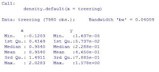
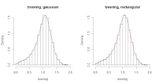
difference between both estimations again is obvious.

Now, from the statistical point of view, if we type on R density(treering), we will get the next:

Which shows the basic statistics for the density estimation, another reason why I found this function pretty interesting and useful.

To finish with this post, I will add the code used for the examples, have a great day! :)


par(mfrow=c(1,2))
hist(treering,prob=1,breaks=20)
lines(density(treering,kernel="gaussian"),col=2)

hist(treering,prob=1,breaks=20)
lines(density(treering,kernel="rectangular"),col=2)

density(treering)


par(mfrow=c(1,2))
hist(UKgas,prob=1,breaks=20)
lines(density(UKgas,kernel="gaussian"),col=2)

hist(UKgas,prob=1,breaks=20)
lines(density(UKgas,kernel="rectangular"),col=2)

Friday 14 August 2009

Everybody loves R

I found this articles in The New York Times" and I thought it would be nice to share them, By ASHLEE VANCE published on January 6, 2009, check them out, both are pretty interesting:

http://www.nytimes.com/2009/01/07/technology/business-computing/07program.html?_r=1

http://bits.blogs.nytimes.com/2009/01/08/r-you-ready-for-r/