Wednesday 7 October 2009

What 'The power of R' is saying

Hey again,

I was looking for random things at google and I found such an interesting site: www.wordle.net, were you can put lots of words or the url of a blog (like this for example) and you get a cloud with the words you put and you can change colors and everything, here's what I got with the blog...


Enjoy it :)


Sunday 6 September 2009

Comparison between 15 different cities...


The other day I was thinking about how expensive will it be to live in London (as I'm going to live in London for almost one year), and also thinking about how expensive are the cities where some of my best friends live and I got a report by UBS called "Prices and Earnings 2009", it's all about life costs and salaries in 100 cities around the world, so I started 'playing' with some of the data from 15 cities in that report and I decided to use R, I used some regressions and bar plots, but I thought it would be interesting to use real examples to make it even more interesting, if anybody needs the code to generate the graphics I posted here just let me know ok?, here is what I got...


Total expenditure in goods and services vs Salary per hour


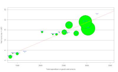
In this first graph, we can think about the salary as a function of the total expenditure in goods and services, the salary tends to increase when the expenditure in goods and services increases, i.e. the more you spend in goods and services in your city, the more you have to earn. An easy way to think about this graphic is that the 'fair' salary for each point in the x axis (expenditure) should be the red line (a linear regression using these points), then, the cities above the red line are the ones who earn more money than the money they should, then the goods and services there are cheaper than they should be; by the other side, the ones below the red line, earn less money than the money they should given what they spend in goods and services in that city, an important thing to say is that the size of the bubbles in the graphics is the GDP for each city. Then, for example, Mexico city (my city) is expensive, but by the other side, London would be 'fair' talking about the expenditure in goods and services. Any comment about the other cities?
To enlarge the graphic click HERE


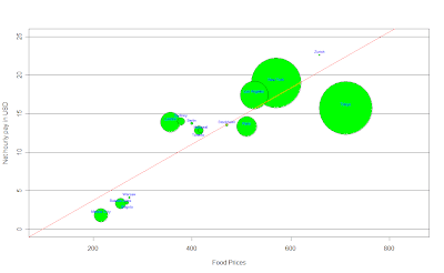
How much will I spend in food in London?


After getting the last graphic, I was wondering how much would I spend in food in London, so I did the same with the data available, it was the cost of a weighted basket of goods with 39 foodstuffs, to be more accurate: the monthly expenditure of average Western family, here is what I got:


To enlarge the image click HERE

It's almost the same than last graphic, but here we have the Net hourly pay in USD per hour as a function of food prices, which, according to a linear regression, the salary should increase as prices in food do so, and again, the bubbles on the line would be the cities with 'fair' food prices according to their salary, here for example, Mexico city it's expensive when we think about food given the net hourly income we have here, but for example, London or Berlin would be cheap, because they earn more than they should given food prices in those cities; while Stockholm has 'fair' prices when we think about food, what do you think about the others?...


What about apartment rents?

After thinking about food and expenditure in goods and services, I also wanted to think about apartment rents, the data I got was the average cost of housing (excluding extremes) per month, which an apartment seeker would expect to pay on the free market at the time of the survey. The figures given are merely tentative values for average rent prices (monthly gross rents) for a majority of local households. Here's the interesting graphic that I got:


To enlarge the image please click HERE

Here we (again) can think about the salary as a function of apartment rents, then, the ones above the line are the 'cheap' ones (given their net hourly pay per hour), the ones below are the 'expensive' ones, and the ones on the red line are the ones who with a 'fair' price.
Mexico city seems to be expensive, while London seems to have 'fair' prices, any comment about New York?


What about going out for dinner?

I think this is such an important topic, wether if you're going out for dinner with friends or if you're going out with a special person... I think it's important to know what cities are expensive to go out for dinner at, don't you think?, the data I used here refers to the price of an evening meal (three-course menu with starter, main course and dessert, without drinks) including service, in a good restaurant, here is the graphic:


To enlarge the image click HERE

Here it's the same idea than in the last 3 graphics, we can think about the salary as a function of restaurant prices, and again (of course), we can see that when restaurant prices increase, we should expect the net hourly pay to increase as well.
We can see that going out for dinner in cities like Mexico City, London or Buenos Aires is expensive, but, by the other side, someone who lives in New York, Montreal, Berlin or Toronto, would find it cheaper given how much they earn per hour in their cities.


Public Transport, how much for a single ride?...

I also found some info about public transport, but I decided to focus on Bus, Tram and Metro, What I did is a bar plot to compare prices in the 15 different cities I chose, here's what I got:


To make the image bigger please click HERE

At least talking about public transport, Mexico City is the cheapest, but what about London or Stockholm?...


An interesting graphic I found...

After analyzing the previous graphics, I started thinking about some other things to analyze, the first one was the relationship between the working hours per year and the net hourly pay in each city, and I found something really interesting:


To enlarge the graphic please click HERE

Isn't it amazing?!!!, What this graphic says is that the less we earn per hour, the more we work!, I was surprised by this, here we have the salary as a function of the working hours per year, and the ones below the red line are the cities that work more than what they earn, and the ones above the red line are the ones that work less than what they earn, all kind of comments accepted...


Have you ever thought about the working time required to buy something?....

Well, I found data about the working time required to buy an Ipod and a Big Mac, pretty sad in some cases, here are the graphics...


To make the graphic bigger please click HERE

We can see how different and hard it is to get an Ipod nano in places like Warsaw, Bogotá, Mexico City or Buenos Aires, but what about London, Los Angeles or New York?, isn't it frustrating?

By the other side, I got the same graphic for a Big Mac:


To make the image bigger click HERE

Ok, this one is pretty sad, I don't know what you think about it, but what it comes to my mind just by looking at this one is inequality, any comments?

Thanks for reading me again, and as I said before, If any of you needs the code to generate this graphics just let me know ok? Have a great day :)

Thursday 20 August 2009

No success yet, then more animations...


So I've been here dealing with the installation of a software that Yihui Xie suggested me to change the format of the animations displayed in R, she told me that all I needed to do was to go to http://imagemagick.org to download ImageMagick for my operating system and install it, but all I got was lots and lots of files and I haven't found the one to start the installation, so I decided to post the last 4 animations I was thinking to post in here with the code to create them in case you want to try them by yourselves.

The first animation I'm going to start with is called "Bootstrapping the i.i.d data", This is a naive version of bootstrapping but may be useful for novices. As you can see in the first image, in the top plot, the circles denote the original dataset, while the red sunflowers (probably) with leaves denote the points being resampled; the number of leaves just means how many times these points are resampled, as bootstrap samples with replacement. The bottom plot shows the distribution of x bar star. The whole process has illustrated the steps of resampling, computing the statistic and plotting its distribution based on bootstrapping.

The code to generate such animation is:

ani.options(ani.height = 500, ani.width = 600, outdir = getwd(),
title = "Bootstrapping the i.i.d data",
description = "This is a naive version of bootstrapping but
may be useful for novices.")
ani.start()
par(mar = c(2.5, 4, 0.5, 0.5))
boot.iid(main = c("", ""), heights = c(1, 2))
ani.stop()


For the second example I chose an animation called "The concept of confidence intervals". This animation shows the concept of the confidence interval which depends on the observations: if the samples change, the interval changes too. At last we can see that thecoverage rate will be approximate to the confidence level.
If you want to generate this animation, the code is the next:

ani.options(ani.height = 400, ani.width = 600, outdir = getwd(), nmax = 100,
interval = 0.15, title = "Demonstration of Confidence Intervals",
description = "This animation shows the concept of the confidence
interval which depends on the observations: if the samples change,
the interval changes too. At last we can see that the coverage rate
will be approximate to the confidence level.")
ani.start()
par(mar = c(3, 3, 1, 0.5), mgp = c(1.5, 0.5, 0), tcl = -0.3)
conf.int()
ani.stop()


The third animation I chose was one I thought would be pretty useful, it's called "The Newton-Raphson Method for Root-finding". I think this animation doesn't need further explanation, it goes along with the tangent lines and iterates, and you can also change the function that the example gives you to try as default, pretty interesting one.
So the code is:

oopt = ani.options(ani.height = 500, ani.width = 600, outdir = getwd(), nmax = 100,
interval = 1, title = "Demonstration of the Newton-Raphson Method",
description = "Go along with the tangent lines and iterate.")
ani.start()
par(mar = c(3, 3, 1, 1.5), mgp = c(1.5, 0.5, 0), pch = 19)
newton.method(function(x) 5 * x^3 - 7 * x^2 - 40 *
x + 100, 7.15, c(-6.2, 7.1), main = "")
ani.stop()
ani.options(oopt)


The last example I thought would be pretty interesting for the ones who had just started learning probability, it's called "Simulation of flipping coins". This animation has provided a simulation of flipping coins, which might be helpful in understanding the concept of probability. This is such a colorful and simple animation, pretty interesting, enjoy it.

If you want to generate it, just type:


oopt = ani.options(ani.height = 500, ani.width = 600, outdir = getwd(), interval = 0.2,
nmax = 50, title = "Probability in flipping coins",
description = "This animation has provided a simulation of flipping coins,
which might be helpful in understanding the concept of probability.")
ani.start()
par(mar = c(2, 3, 2, 1.5), mgp = c(1.5, 0.5, 0))
flip.coin(faces = c("Head", "Stand", "Tail"), type = "n",
prob = c(0.45, 0.1, 0.45), col =c(1, 2, 4))
ani.stop()
ani.options(oopt)


Wednesday 19 August 2009

2 Interesting animations...


So I haven't had success YET in finding a way to post here the animations, but I thought it would be interesting to show you at least a couple of examples using this software, and I chose 2 pretty interesting ones by Yihui Xie and Xiaoyue Cheng.

The first one is "The Gradient Descent Algorithm", it follows the gradient to the optimum. The arrows will take you to the optimum step by step. By the end of the animation, you get something like the image above.


The code to generate such animation is:

library(animation)
# gradient descent works
oopt = ani.options(ani.height = 500, ani.width = 500, outdir = getwd(), interval = 0.3,
nmax = 50, title = "Demonstration of the Gradient Descent Algorithm",
description = "The arrows will take you to the optimum step by step.")
ani.start()
grad.desc()
ani.stop()
ani.options(oopt)

For the second example I chose an animation called "The k-Nearest Neighbour Algorithm",where, for each row of the test set, the nearest (in Euclidean distance) training set vectors are found, and the classification is decided by majority vote, with ties broken at random.

By the end of the animation, you will get something like this:


The code to generate such animation is:

library(animation)
oopt = ani.options(ani.height = 500, ani.width = 600, outdir = getwd(), nmax = 10,
interval = 2, title = "Demonstration for kNN Classification",
description = "For each row of the test set, the k nearest (in Euclidean
distance) training set vectors are found, and the classification is
decided by majority vote, with ties broken at random.")
ani.start()
par(mar = c(3, 3, 1, 0.5), mgp = c(1.5, 0.5, 0))
knn.ani()
ani.stop()
ani.options(oopt)


I'll keep trying to find the way to upload the whole animations and not just the final result these days, wish me luck!


Tuesday 18 August 2009

Have you ever heard about the 'animation package'?

Well, I had never heard about it, but this morning I was looking for some information about another package and I found and article about this interesting package at 'The R-Journal' (http://journal.r-project.org/), it was on the Vol. 8/2, October 2008, by Yihui Xie and Xiaoyue Cheng, and it says something like...


"The animation package (Xie, 2008) uses graphical and
other animations to communicate the results of statistical
simulations, giving meaning to abstract statistical theory."


Awesome!, isn't it?. The basic idea of an animation, consists of multiple image frames, which can be designed to correspond to the successive steps of an algorithm or of a data analysis.

The basic schema for all animation functions in the package is:


ani.fun <- function(args.for.stat.method,args.for.graphics, ...) {
{stat.calculation.for.preparation.here}
i = 1
while (i <= ani.options("nmax") &other.conditions.for.stat.method) {
{stat.calculation.for.animation}
{plot.results.in.ith.step}
# pause for a while in this step
Sys.sleep(ani.options("interval"))
i = i + 1
}
# (i - 1) frames produced in the loop
ani.options("nmax") = i - 1
{return.something}
}

I will leave this post here while I find the way to upload the animations in here, hope not to delay too much in that.

Have a nice day ;)

The density function


Today I found such an interesting function called "density", this function computes kernel density estimates, that's why I found it pretty interesting, all you need is:

  1. the the data from which the estimate is to be computed
  2. the smoothing kernel to be used (This must be one of "gaussian", "rectangular", "triangular", "epanechnikov", "biweight", "cosine" or "optcosine", with default "gaussian", and may be abbreviated to a unique prefix -single letter.)

For example, I used some of the datasets included in R to use this function with different kernels, my first example was using the data set called 'UKgas', which contains the Quarterly UK gas consumption from 1960Q1 to 1986Q4, in millions of therms. The 1st image shows the histogram of given data set using a gaussian kernel, while the second image shows the same but using a rectangular kernel, where the diference between both estimations is obvious.

For the 2nd example I used a dataset called 'Treering', which contains normalized tree-ring widths in dimensionless units, here the 2nd image uses a gaussian kernel, and the image on the left uses a rectangular kernel, where the difference between both estimations again is obvious.

Now, from the statistical point of view, if we type on R density(treering), we will get the next:

Which shows the basic statistics for the density estimation, another reason why I found this function pretty interesting and useful.

To finish with this post, I will add the code used for the examples, have a great day! :)


par(mfrow=c(1,2))
hist(treering,prob=1,breaks=20)
lines(density(treering,kernel="gaussian"),col=2)

hist(treering,prob=1,breaks=20)
lines(density(treering,kernel="rectangular"),col=2)

density(treering)


par(mfrow=c(1,2))
hist(UKgas,prob=1,breaks=20)
lines(density(UKgas,kernel="gaussian"),col=2)

hist(UKgas,prob=1,breaks=20)
lines(density(UKgas,kernel="rectangular"),col=2)

Friday 14 August 2009

Everybody loves R

I found this articles in The New York Times" and I thought it would be nice to share them, By ASHLEE VANCE published on January 6, 2009, check them out, both are pretty interesting:

http://www.nytimes.com/2009/01/07/technology/business-computing/07program.html?_r=1

http://bits.blogs.nytimes.com/2009/01/08/r-you-ready-for-r/