The other day I was thinking about how expensive will it be to live in London (as I'm going to live in London for almost one year), and also thinking about how expensive are the cities where some of my best friends live and I got a report by UBS called "Prices and Earnings 2009", it's all about life costs and salaries in 100 cities around the world, so I started 'playing' with some of the data from 15 cities in that report and I decided to use R, I used some regressions and bar plots, but I thought it would be interesting to use real examples to make it even more interesting, if anybody needs the code to generate the graphics I posted here just let me know ok?, here is what I got...
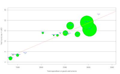
Total expenditure in goods and services vs Salary per hour
In this first graph, we can think about the salary as a function of the total expenditure in goods and services, the salary tends to increase when the expenditure in goods and services increases, i.e. the more you spend in goods and services in your city, the more you have to earn. An easy way to think about this graphic is that the 'fair' salary for each point in the x axis (expenditure) should be the red line (a linear regression using these points), then, the cities above the red line are the ones who earn more money than the money they should, then the goods and services there are cheaper than they should be; by the other side, the ones below the red line, earn less money than the money they should given what they spend in goods and services in that city, an important thing to say is that the size of the bubbles in the graphics is the GDP for each city. Then, for example, Mexico city (my city) is expensive, but by the other side, London would be 'fair' talking about the expenditure in goods and services. Any comment about the other cities?

To enlarge the graphic click HERE
How much will I spend in food in London?
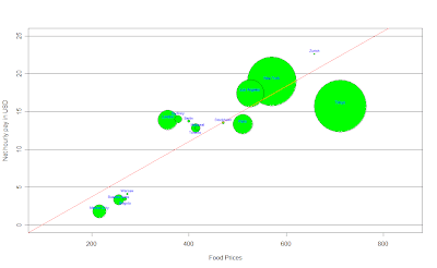
After getting the last graphic, I was wondering how much would I spend in food in London, so I did the same with the data available, it was the cost of a weighted basket of goods with 39 foodstuffs, to be more accurate: the monthly expenditure of average Western family, here is what I got:

To enlarge the image click HERE
It's almost the same than last graphic, but here we have the Net hourly pay in USD per hour as a function of food prices, which, according to a linear regression, the salary should increase as prices in food do so, and again, the bubbles on the line would be the cities with 'fair' food prices according to their salary, here for example, Mexico city it's expensive when we think about food given the net hourly income we have here, but for example, London or Berlin would be cheap, because they earn more than they should given food prices in those cities; while Stockholm has 'fair' prices when we think about food, what do you think about the others?...
What about apartment rents?
After thinking about food and expenditure in goods and services, I also wanted to think about apartment rents, the data I got was the average cost of housing (excluding extremes) per month, which an apartment seeker would expect to pay on the free market at the time of the survey. The figures given are merely tentative values for average rent prices (monthly gross rents) for a majority of local households. Here's the interesting graphic that I got:
To enlarge the image please click HERE
Here we (again) can think about the salary as a function of apartment rents, then, the ones above the line are the 'cheap' ones (given their net hourly pay per hour), the ones below are the 'expensive' ones, and the ones on the red line are the ones who with a 'fair' price.
Mexico city seems to be expensive, while London seems to have 'fair' prices, any comment about New York?
What about going out for dinner?
I think this is such an important topic, wether if you're going out for dinner with friends or if you're going out with a special person... I think it's important to know what cities are expensive to go out for dinner at, don't you think?, the data I used here refers to the price of an evening meal (three-course menu with starter, main course and dessert, without drinks) including service, in a good restaurant, here is the graphic:

To enlarge the image click HERE
Here it's the same idea than in the last 3 graphics, we can think about the salary as a function of restaurant prices, and again (of course), we can see that when restaurant prices increase, we should expect the net hourly pay to increase as well.
We can see that going out for dinner in cities like Mexico City, London or Buenos Aires is expensive, but, by the other side, someone who lives in New York, Montreal, Berlin or Toronto, would find it cheaper given how much they earn per hour in their cities.
Public Transport, how much for a single ride?...
I also found some info about public transport, but I decided to focus on Bus, Tram and Metro, What I did is a bar plot to compare prices in the 15 different cities I chose, here's what I got:

To make the image bigger please click HERE
At least talking about public transport, Mexico City is the cheapest, but what about London or Stockholm?...
An interesting graphic I found...
After analyzing the previous graphics, I started thinking about some other things to analyze, the first one was the relationship between the working hours per year and the net hourly pay in each city, and I found something really interesting:

To enlarge the graphic please click HERE
Isn't it amazing?!!!, What this graphic says is that the less we earn per hour, the more we work!, I was surprised by this, here we have the salary as a function of the working hours per year, and the ones below the red line are the cities that work more than what they earn, and the ones above the red line are the ones that work less than what they earn, all kind of comments accepted...
Have you ever thought about the working time required to buy something?....
Well, I found data about the working time required to buy an Ipod and a Big Mac, pretty sad in some cases, here are the graphics...

To make the graphic bigger please click HERE
We can see how different and hard it is to get an Ipod nano in places like Warsaw, Bogotá, Mexico City or Buenos Aires, but what about London, Los Angeles or New York?, isn't it frustrating?
By the other side, I got the same graphic for a Big Mac:

To make the image bigger click HERE
Ok, this one is pretty sad, I don't know what you think about it, but what it comes to my mind just by looking at this one is inequality, any comments?
Thanks for reading me again, and as I said before, If any of you needs the code to generate this graphics just let me know ok? Have a great day :)


This post is great! :D
ReplyDeleteAnd yes, I need the code to generate the graphics :) they are so entertaining :)
Very nice presentation of the graphics. Now I did only skim the text so I apologize if you discussed the following. One of the problems with comparing various places, especially when there are large differences in relative prices, is the fact your optimal choices will be very different in each city -- One place you might find you enjoy lots of nights out and a tiny apartment, another you find a large place and lots of entertaining are better. Those differences are hard to communicate.
ReplyDeleteWould you be able to send me the code for this? I would love to use this approach to display a different set of data. E-mail is klh1005@gmail.com, thanks in advance!
ReplyDeletepretty good i will love to get the codes for this plots because i have a work to do about comparing about three variables or more i will be grateful if i should get this
ReplyDelete